Disney Inspiration: Baroque Glam
A few weeks ago I shared how much the show Reign influenced my wardrobe. This week I want to discuss how much the award-winning, 2017 live-action version of Beauty and the Beast inspired my interior design preferences!
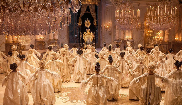
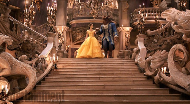
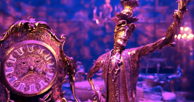
If you can't tell, this film blows me away. From the cinematography to the music to the new story angles they incorporated into the narrative, I find it incomparably compelling. Seriously. I saw it three times in the theaters which is more than I have paid to see any other movie in years. What I love most about the film is the overall design and mood. Nearly every shot is frame-worthy and stunning. From the castle to the town to the forest, the design is tastefully embellished. While I admired every set this movie created, I am going to focus specifically on the castle for this post. Golden accents, wainscoting, crystal chandeliers and elaborate designs in the castle from the floor to ceiling take my breath away. It's MAGICAL!
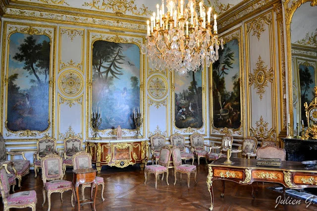
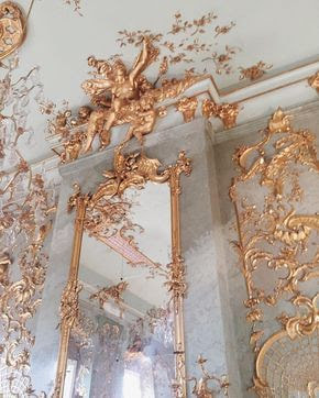
If I could design my dream house with an endless budget, I would incorporate a great deal of this glamorous, Baroque/Rococo look. Think Versailles meets Beast's castle toned down a few notches. That's my look.
Because this film filled me with so much inspiration, I decided to do some research on the Baroque Era and its architectural characteristics. According to my sources, including Encyclopedia Brittanica, Baroque architecture is associated with grandeur, emotional exuberance, sensuous richness, vitality, movement, tension and a tendency to blur distinctions between the various arts. The style started around 1600 in Rome, Italy and spread to most of Europe.
I learned that Rococo design emerged in France in the early 1700's as a continuation of the Baroque style with slight differences. Rococo design is characterized by lightness, elegance and curving natural forms in ornamentation (usually in the shape of a "c" or "s"). In Rococo design, light pastels, ivory white and gold were the predominant colors and mirrors were frequently used to create the feel of more open space.
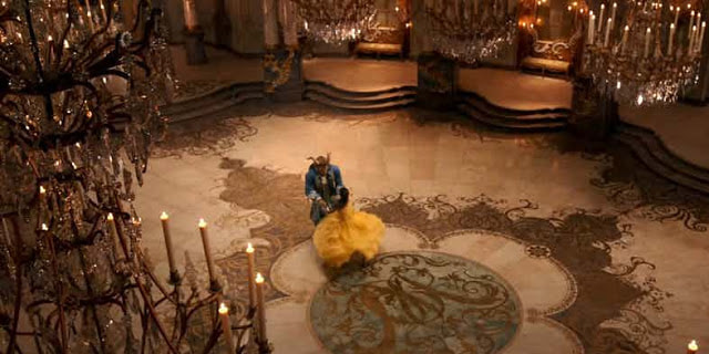
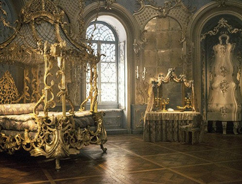
So which style does Beauty and the Beast truly reflect? I think it's a good mixture of both styles, as Rococo is cut from Baroque. There are lots of golden accents and interesting ornaments on the walls that have the telltale Rococo shapes. According to a stellar feature in Architectural Design, the set of Beauty and the Beast was indeed a mix of Rococo and Baroque design. Belle's bedroom and the ballroom were Rococo-inspired, and the West Wing, where Beast dwells, is an Italian Baroque design. The design themes blend seamlessly and make the castle breathtaking.
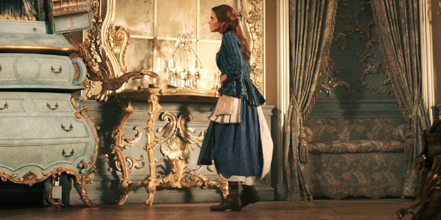
Want to know what my dream bedroom looks like? Take a good look at Belle's amazingly ornate bedroom, tone it down a few notches, add some purple and electricity and there you have it! The detail though! Such eye candy. And the GOLD accents literally make me giddy with awe to just look at (weird, I know). I think the details and texture make the room complex, with each detail adding a slightly different emotion. For instance, the light blue color of the walls is calming and restful. But the golden accents and designs on the walls add an elegant, feminine and dreamlike quality to the room. So the room is both relaxing and formal...somehow.
It is a good refuge for Belle while things are otherwise so frightening and horrific at the castle with her being a prisoner. The special design also visually communicates how valuable Belle is as the one who will break the curse and liberate the whole castle! At any rate, it's magical and regal and I want to live there.
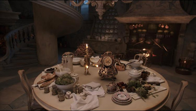
The dining room and Beast's room are also works of art. With a darker and more intense vibe than the Ballroom or Belle's room, they accent the darker emotional tension between Beast and Belle throughout the first half of the film well. While the glamour of the ballroom reflects the sparks that begin to warm between the two of them as the film continues. I suppose set decorators think about these factors while designing them...
While I love the mysterious, romantic, candlelit ballroom in the classical dance scene (shown earlier), I also appreciated the naturally lit, fresh version of the ballroom in the final scene. Plus Belle's dress here is quite splendid.
I could have gushed over many aspects of this film. The music, costumes, acting and plot developments are all equally praiseworthy. There is a reason why this tale is as old as time--the story is timeless and classic. But to me the design of the castle and amazing details make this live-action version worth watching repeatedly. Surely now anyone can see why this film won Oscars for Best Production Design and Best Costume Design!
Do you have a film that inspires your design taste? One that you could watch all the time because of the mental escape it provides? I'd love to hear!
Resources:
https://www.architecturaldigest.com/gallery/beauty-and-the-beast-set-design
https://www.britannica.com/art/Baroque-art-and-architecture


